So zeigen Sie den Prozentsatz im Kreisdiagramm in Excel an – Eine vollständige Anleitung
In Excel, pie charts are powerful tools for visualizing data distributions, allowing you to quickly grasp the relative importance of different categories at a glance. A common enhancement to these charts is displaying percentages, which can provide clearer insights into the proportions each segment represents. This tutorial will guide you through different methods of adding percentage labels to your pie charts in Excel, enhancing the readability and effectiveness of your data presentations.
- By changing the chart styles
- By changing the overall layout of the chart
- By adding the Percentage label
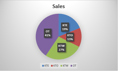
Show percentage in pie chart
In this section, we will explore several methods to display percentage in a pie chart in Excel.
By changing the chart styles
Excel offers a variety of built-in chart styles that can be applied to pie charts. These styles can automatically include percentage labels, making this a quick and straightforward option for enhancing your chart's clarity.
- Select the pie chart to activate the Diagrammwerkzeuge Registerkarte im Excel-Menüband.
- Gehen Sie zum Diagrammdesign Tab unter Diagrammwerkzeuge, browse through the style options and select one that includes percentage labels.
Tipp: Hovering over a style will give you a live preview of how it will look.
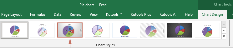
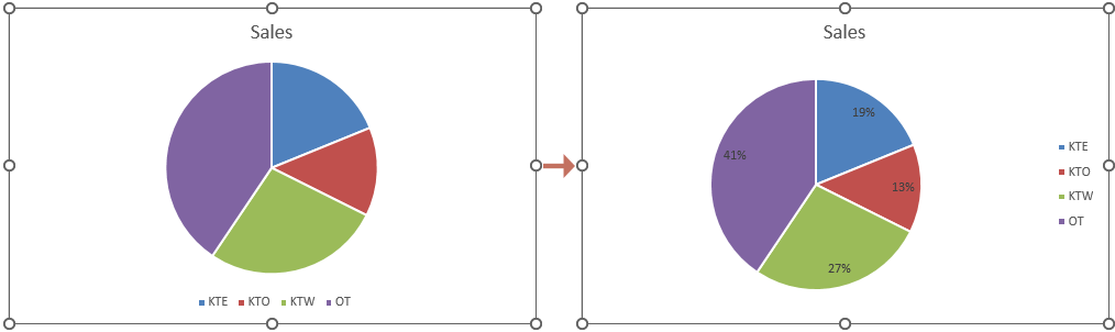
Ergebnis
The desired style then applies to your selected pie chart. The percentages should now be visible on your pie chart. See screenshot:
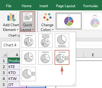
By changing the overall layout of the chart
Changing the overall layout of your pie chart can give you more control over which elements are displayed, including data labels that can be formatted to show percentages.
- Select the pie chart for which you want to show percentage.
- Gehen Sie zum Diagrammdesign Tab unter Diagrammwerkzeuge, drücke den Schnelles Layout drop-down list, and then select a layout that includes percentage labels.
Tipp: Hovering over a layout will give you a live preview of how it will look.
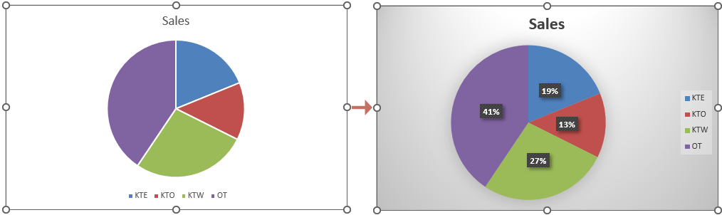
Ergebnis
The percentages should now be visible on your pie chart. See screenshot:
By adding the Percentage label
For a more direct approach, you can specifically enable and customize percentage labels without altering other chart elements. Please follow the steps below to get it done.
- Right click the pie chart that you want to show percentages, and then select Hinzufügen von Datenbeschriftungen in dem Kontextmenü.
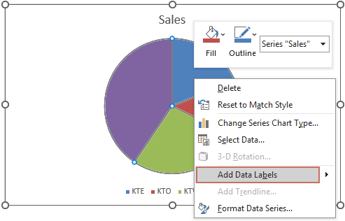
- Now data labels have now been added to the chart. You need to right click on the chart again and choose Datenetiketten formatieren aus dem Kontextmenü.

- Das Datenetiketten formatieren pane is now displayed on the right side of Excel. You then need to tick the Prozentsatz Box in der Beschriftungsoptionen Gruppe.
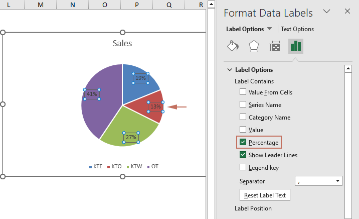 Note: Ensure the "Prozentsatz" option is ticked. You can then keep any label options you need. For example, you can also select "Category name" if you want both the name and percentage to appear.
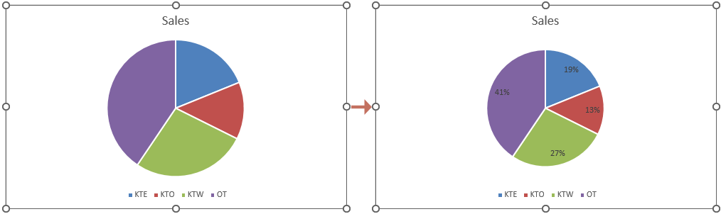
Ergebnis
Now percentages are shown in the selected pie chart as shown in the screenshot below.
By following the detailed steps outlined above, you can effectively display percentages in your Excel pie charts, thereby making your data visualizations more informative and impactful. Enhance your reports and presentations by applying these techniques to present data in a more accessible and understandable way. For those eager to delve deeper into Excel's capabilities, our website boasts a wealth of tutorials. Entdecken Sie hier weitere Excel-Tipps und Tricks.
Beste Office-Produktivitätstools
Verbessern Sie Ihre Excel-Kenntnisse mit Kutools für Excel und erleben Sie Effizienz wie nie zuvor. Kutools für Excel bietet über 300 erweiterte Funktionen, um die Produktivität zu steigern und Zeit zu sparen. Klicken Sie hier, um die Funktion zu erhalten, die Sie am meisten benötigen ...
")
Office Tab Bringt die Oberfläche mit Registerkarten in Office und erleichtert Ihnen die Arbeit erheblich
- Aktivieren Sie das Bearbeiten und Lesen von Registerkarten in Word, Excel und PowerPoint, Publisher, Access, Visio und Project.
- Öffnen und erstellen Sie mehrere Dokumente in neuen Registerkarten desselben Fensters und nicht in neuen Fenstern.
- Steigert Ihre Produktivität um 50 % und reduziert jeden Tag Hunderte von Mausklicks für Sie!
")